Online fashion stores are no longer competing solely on who has the most products or the biggest discounts. Customers remember brands based on their first impression of the website, the color palette, the emotional impact of product images, the use of negative space, and even the language the store uses to communicate with them. All of this constitutes Art Direction, which helps communicate "who we are, what we sell, and our identity" even before customers click to view products.
list of contents
- How is art direction important to online fashion stores?
- Artistic elements that make a storefront look more upscale.
- Mood and tone are the visible voice of a brand.
- Storytelling takes products beyond just items on a shelf.
- Transform your art into a marketable item on e-commerce.
- Checklist before designing a fashion store.
How is art direction important to online fashion stores?
Fashion is a product that people buy based on both reason and emotion. Good quality fabric, reasonable price, and available sizes are the reasons, but the feeling of "this brand represents me" is what makes people want to follow the brand, want to check out new collections, and are willing to pay for an image that reflects their own identity.
Art Direction therefore acts like a visual director for an online store. It dictates how sleek, cool, vibrant, sophisticated, raw, luxurious, or playful the brand should look, and then translates that feeling into the visuals, colors, lighting, typography, layout, and storytelling method on the website. If everything is out of place, customers will immediately feel that the store lacks clarity, no matter how long the text is written to explain it.
Shops with a clear physical presence will sell more easily.
Consider two clothing stores selling the same white dress. One store uses bright lighting, plenty of empty space, and simple captions. The other uses flashy lighting, cramped compositions, and fun, confident language. The products may be similar, but the feeling is different. This is why composition matters. Graphic design And visual systems are more important to fashion stores than many people realize.
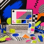
Artistic elements that make a storefront look more upscale.
Artistic composition isn't just for art galleries; in online stores, it's what guides the customer's gaze from the cover image to the product name, from the price to the buy button, and from the lookbook to featured products seamlessly. Well-placed elements make a website appear more cohesive, trustworthy, and highlight products without being overly flashy.
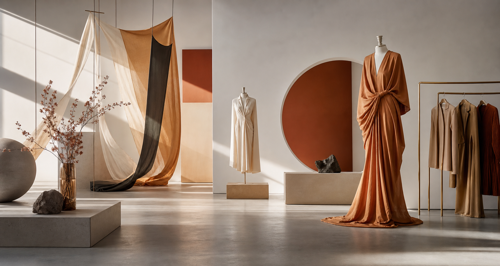
1. Balance: The balance between products and the atmosphere.
Some fashion stores use so much mood-based imagery that customers can't find their products. Others only use images of individual products, lacking personality. The good approach is to use atmospheric images to open up the brand's world, and then use individual product images to facilitate the purchasing decision. Both approaches should work together and not compete with each other.
2. Rhythm: The rhythm of page scrolling.
A good webpage should have a rhythm similar to an editorial spread, with sections for viewing the big picture, scanning products, resting the eyes, and making decisions. If all sections are the same thickness, customers will get tired. If everything is too sparse, the website will lack sales momentum.
3. Contrast: A focal point that doesn't detract from the overall harmony.
Contrast doesn't always mean strong, contrasting colors. It could be a close-up image paired with a distant image, slender text with a heavier headline, or a rough fabric texture against a smooth background. These small differences help create a sophisticated look for a store and make products stand out more.
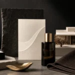
Empty space is not wasted space.
In fashion, negative space allows products to breathe, enhances a premium look, and makes key features more visible. Good minimalism isn't about eliminating everything, but about keeping only what helps customers understand the brand and make purchases faster.
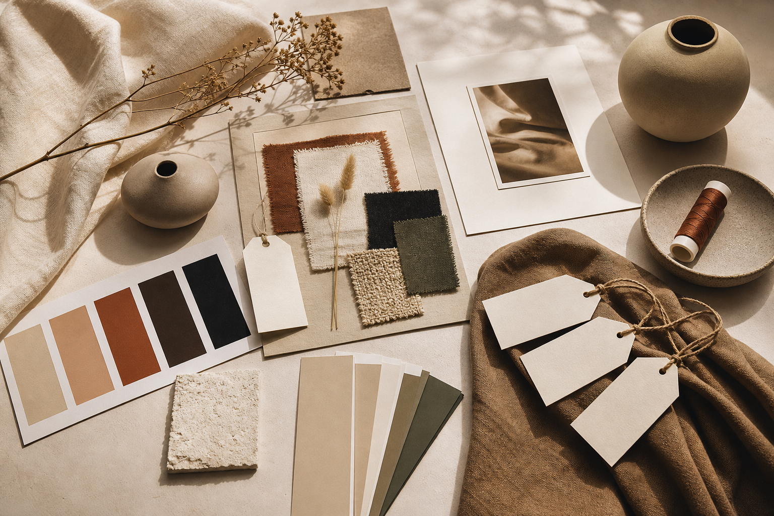
Mood and tone are the visible voice of a brand.
Mood refers to the emotion the shop wants people to feel, while Tone is the way it consistently communicates and presents that emotion. If the Mood is "soft, quiet, subtle," the Tone might be cream colors, natural lighting, short wording, and a layout that doesn't rush customers. But if the Mood is "bold, urban, fast," the Tone might be flashy images, strong crops, sharp colors, and more direct copy.
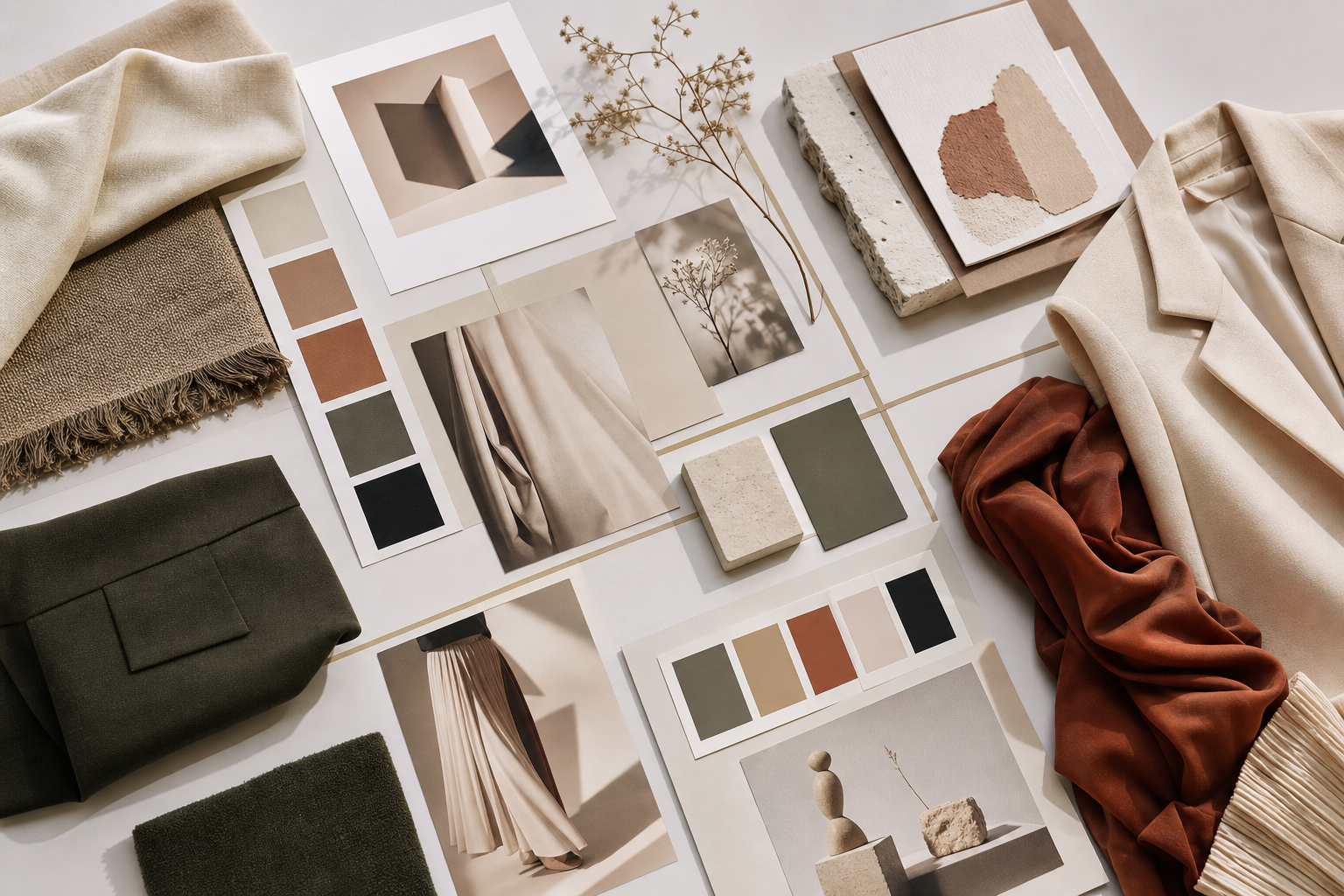
A good mood board should be able to make decisions on behalf of the brand.
A mood board shouldn't just be a collection of pretty images saved on a board. It should clearly state what works and what doesn't. For example, use natural light, avoid heavy shadows, use a simple background, don't use too many props, and use models in natural poses, avoiding stiff postures. The clearer the boundaries, the better the photography, web, and content teams will work together.
Questions that help find the mood and tone.
- If the shop were a person, how would they dress, speak, and walk into the room?
- Customers should feel confident, comfortable, having fun, or more mature after seeing the brand.
- What colors and images would a store not use, even if they are currently trending?
- How should each product be seen in real life, not just on a white background?
Storytelling takes products beyond just items on a shelf.
Fashion stores that tell good stories can give ordinary products context. For example, a shirt might not just say "comfortable cotton," but that it's for days when you want to look neat without feeling constrained. Or a bag might explain that it's designed for people who travel around the city all day but still want to look sophisticated and stylish.
Doing Storytelling It doesn't mean writing a long story on every page, but rather making sure the product images, collection names, descriptions, and online store tell the same story. If a brand sells simplicity, but the website is cluttered with competing colors, sounds, and buttons, the narrative will immediately fall apart.
Tell the story from the perspective of what the shop is really like.
Brands don't need to tell grand stories. A small shop that selects its own fabrics, uses simple patterns, and produces limited quantities can effectively tell a story of intention and perfect fit. A street fashion brand, on the other hand, might charmingly convey the energy of the city, speed, and subculture. The important thing is not to copy the mood of other brands to the point of forgetting your own identity.
Transform your art into a marketable item on e-commerce.
The artwork in an online store must be beautiful and keep customers engaged. The homepage should create a positive impression, category pages should aid selection, product detail pages should answer questions, and the checkout page should be as simple as possible. Because when it comes to payment, customers don't want complicated artwork; they want confidence and clarity.
For stores that need a real point-of-sale system, the setup... Fashion E-Commerce You should think about everything from the overall brand image to the functionality, such as size options, colors, stock, featured products, wishlist, shipping methods, payment methods, and conversion tracking. Because sales aren't just about a pretty image, but about a seamless experience from the moment you see the product until you complete the purchase.
This is where Art Direction meets UX.
The buy button should be prominent enough but not detract from the store's mood. Notification colors should be clear but not clash with the visual system. Product filters shouldn't be so deeply hidden that customers can't find the items, and product images shouldn't be so visually appealing that the actual product isn't visible. This is where artistry and functionality must work together, not compete with each other.
Product images should serve multiple purposes.
- The hero image is used to open the mood of the collection.
- Lookbook images are used to tell a story about styling and lifestyle.
- Individual product images are used to describe the shape, color, details, and material.
- Close-up images are used to ensure quality.
- Images of the actual product help customers better assess the fit and proportions.
A small but important precaution.
Don't let the beautiful image's mood overshadow crucial information, such as unclear sizes, overly inaccurate colors, or the buy button blending into the background. Online fashion sales require both emotion and honesty towards the product; otherwise, returns and customer hesitation will follow.
Checklist before designing a fashion store.
- Define your brand identity in 3-5 words, such as calm, modern, playful, premium.
- Define primary, secondary, and forbidden colors to maintain an overall consistent look.
- Establish a comprehensive product image strategy that includes mood, lookbook, product, and detail.
- Clearly articulate your brand's tone—whether friendly, polite, cool, or editorial.
- Design the homepage, categories, product details, and checkout sections to have different functions.
- Prepare a measurement system to see which pages attract attention and which pages distract people.
In summary: The shops I remember are those that controlled the visuals and the storytelling.
For online fashion stores, art direction isn't just about making the website look pretty; it's about organizing the brand's feel so customers can perceive it in seconds. If the artistic elements, mood and tone, product images, and storytelling are consistent, the store will have a memorable personality, and every page will help tell who the brand is for.
Establish a clear store image before actually starting sales.
If your store is planning a fashion website or wants to enhance its online presence, our creative team can help with everything from art direction, mood and tone, UX/UI, and e-commerce systems to content that tells your brand story in a credible and memorable way.