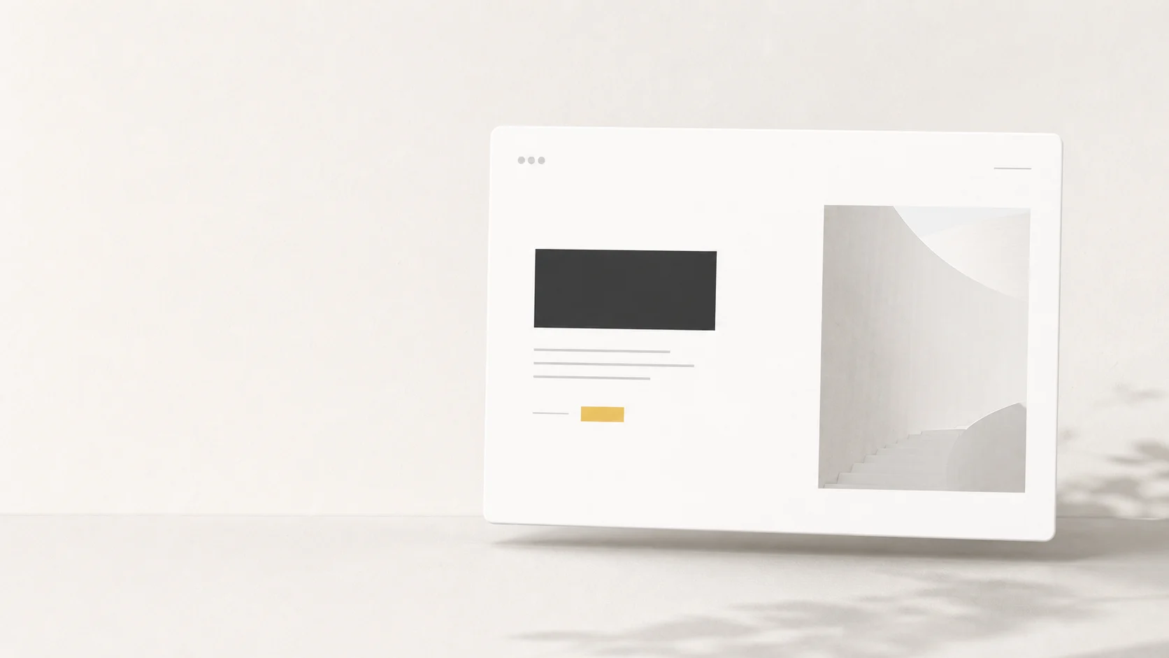
Have you ever noticed that high-end brand websites often don't cram everything onto a single screen? Instead, they leave more breathing room for text, images, buttons, and menus than we're used to. Some pages are almost completely minimalist, yet they exude a sense of calm, confidence, and trustworthiness.
That is called... White Space White space in design isn't just "leftovers" after all the elements are in place, but a crucial tool that helps organize the viewer's gaze, control the mood, and make it easier for readers to understand the brand's message. This article will guide you from the basics to how to use white space to make your website look premium without looking unnecessarily empty.
What is white space in design?
White space refers to the empty space around and between elements in a design. This includes the spacing between headings and content, image margins, line spacing, the area around buttons, or the space between sections on a website. Although the name includes "white," it doesn't necessarily have to be white. It can be black, gray, a background image, or even the brand color, as long as it serves as a visual resting space.
In design terms, it's sometimes called Negative Space because it's an area that "doesn't have objects placed in it," but directly affects what is placed there. Like a room with minimal but well-arranged furniture; we don't feel like the room is lacking anything, but rather that every item has been carefully chosen.
White space is not wasted space.
The problem with many websites isn't a lack of information, but a lack of rhythm to allow readers to distinguish what's important first and what comes later. Spacing acts like punctuation in sentences. Without spacing, the text would still have all the characters, but the meaning would become immediately difficult to understand.
Macro White Space and Micro White Space
White space can be both large and small. Large white space refers to the space between sections, heroes, images, text blocks, or the left and right margins of a webpage. Small white space refers to the spacing between characters, lines, bullet points, buttons, and form fields.
Small details that have a big impact.
A well-designed website isn't just good because of pretty images, but also because the small spaces between elements are carefully controlled. When microspace is good, readers unconsciously perceive the work as more refined.
Why do expensive designs use so much white space?
Premium design isn't often achieved by cluttering the space with numerous elements, but by choosing what the viewer should "focus on" and "not focus on." Empty space, therefore, is a language of confidence. Brands that know what they want to communicate don't need to say everything at once.
This concept is close to... Minimalist Design But it's not about making the workspace as clutter-free as possible. The key is to leave only what's essential and provide enough space for those essential elements to function fully.
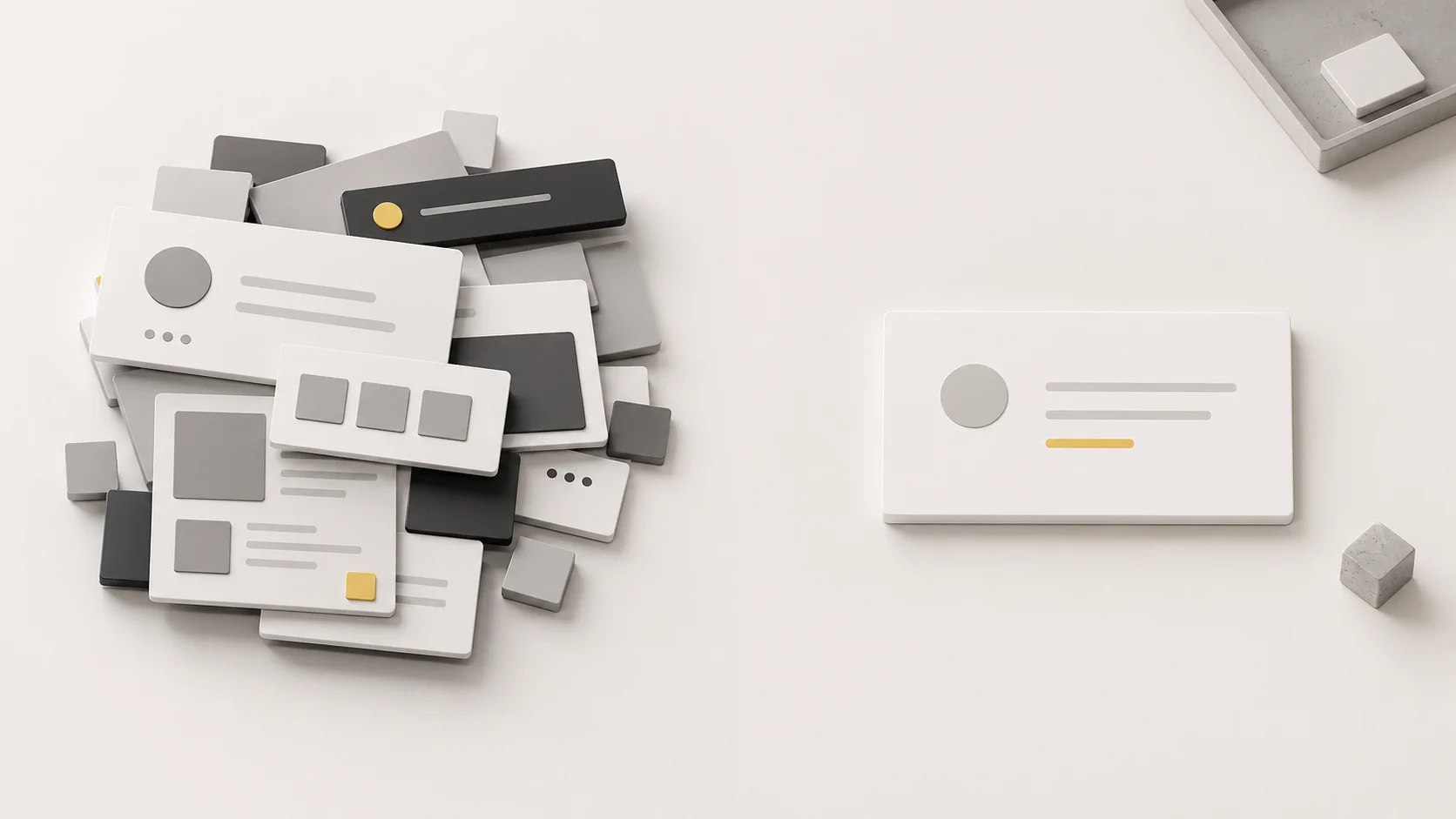
1. Helps make important things seem truly important.
If everything on a webpage is equally prominent, nothing truly stands out. The empty space around the headline, main image, or important buttons helps viewers quickly understand that the element is the focal point. It's like placing a single product in the vitrine of a luxury store; the more space surrounding it, the higher its visual value.
2. It makes the brand appear calm and confident.
An overly cluttered website often conveys a sense of rush or an attempt to sell everything at once. Conversely, whitespace allows a brand to appear rhythmic, organized, and confident in its offerings. This feeling is crucial for businesses seeking to build trust, such as clinics, real estate, B2B services, corporate services, or premium products.
3. Makes reading and decision-making easier.
People don't read every line of a book from beginning to end when they read a webpage. They usually scan the page first to see what it's about and whether it's trustworthy, then select parts to read. White space helps with smoother scanning, making headings, groups of information, and relevant buttons visible without requiring much thought.
How to use white space in website design to make it look sophisticated.
Using white space effectively isn't about randomly adding margins, but rather starting with a simple question: what do we want the user to understand first in each section, and how should other elements support that point?
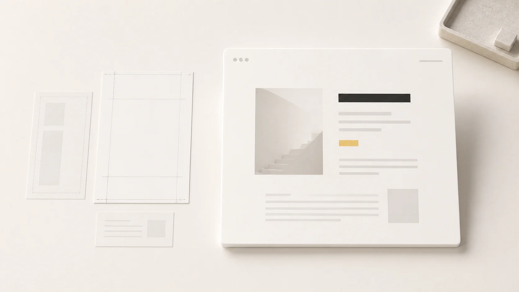
Start by prioritizing the content.
Before arranging the layout, write down the order of the hero message, supporting copy, proof, image, form, CTA, and supplementary information. Once the order is known, whitespace will be used to separate layers of information, not just for aesthetic purposes. Website UX/UI Design A good approach, therefore, views white space as part of the user experience, not just as a visual element.
Leave a space around the elements you want people to remember.
To make headlines memorable, don't let them be cluttered with menus, icons, or multiple buttons. To encourage clicks, avoid placing them too close to other, equally important options. Space effectively indicates "this is the key point" without needing arrows or additional descriptive text.
Control your reading pace with line spacing and paragraph breaks.
Good white space isn't just at the edges of the screen, but also throughout the content. Paragraphs that are too long tire the reader, while lines that are too close together cause the text to clump together. Therefore, font choice and spacing should be considered in conjunction with these principles. Typography It's not something to fix afterward when the website already looks cluttered.
Don't forget mobile spacing.
Many websites look great on desktop, but when viewed on mobile, the elements become cluttered because the screen size is reduced without adjusting the spacing and negative space. Spacing on mobile needs to be considered separately, especially between headings, content, buttons, and forms.
Tested with actual readings.
Try opening the webpage on your mobile device and reading it as a real customer. If you have to squint, reread, or don't know where to click, it means the spacing isn't helping you as much as it should.
Mistakes that make White Space seem inexpensive.
Misuse of white space can make a design look empty, rigid, or unfinished. The difference between "intentional empty space" and "empty space that seems incomplete" lies in the structure and reason for the spacing.
Lots of space, but no visual order.
Some designs use a lot of white space, but headlines, images, and buttons still clash because the weight of each element isn't clearly defined. The result is a website that looks cluttered but isn't engaging. The solution is to organize the layout first, then use space to highlight those differences.
Use blank space to replace the content that should be there.
A premium website doesn't always have to be concise. If your product or service requires information to aid decision-making, such as pricing, procedures, portfolio, or FAQs, it should be complete. The key is to present the information in an easy-to-read format, rather than omitting details to the point where customers remain uncertain.
Follow the template without looking at the actual content.
A template that looks great in a sample might have less content than our actual website. Once you add the real text, images, and business terms and conditions, the initially flattering design might start to distort. Therefore, it's best to design based on the actual content as quickly as possible.
Checklist for using white space to make your website readable and look premium.
- Identify the goal of each section before arranging the layout.
- Give more space to elements you want users to remember or click.
- Maintain consistent spacing between headings, paragraphs, images, and buttons.
- Use colors, lines, or boxes only as needed, so as not to compete with the role of white space.
- Check actual reading performance on desktop, tablet, and mobile.
- Don't remove important information just to make the workspace look cluttered.
- Look at the overall picture to see if the website is conveying the brand's feeling, not just whether it looks "minimalist" or not.
In summary: The high price of design starts with daring to leave room.
White space isn't just about making a website look cluttered, but rather a way of thinking about communication. Brands that utilize white space effectively make users feel that everything is thoughtfully chosen, that there's a rhythm to understand, and that they have enough confidence not to need to constantly shout.
If you want your website to look more premium, the starting point might not be adding new effects or more complex visuals, but rather revisiting what should stay, what should be left out, and what deserves enough space for people to truly appreciate its value.
I want the website to look more stable, easy to read, and trustworthy.
The Creative team helps structure website pages, align content rhythm, images, and whitespace to ensure consistency with the brand, whether it's a new website or updating existing pages to give them a more premium look.