The term "modern" changes very quickly. What seems new today may become the hallmark of a certain era in a few years. However, some works remain contemporary even after a long time because they don't rely solely on the latest effects, but rather on a clear structure, precise composition, and flexible visual systems.
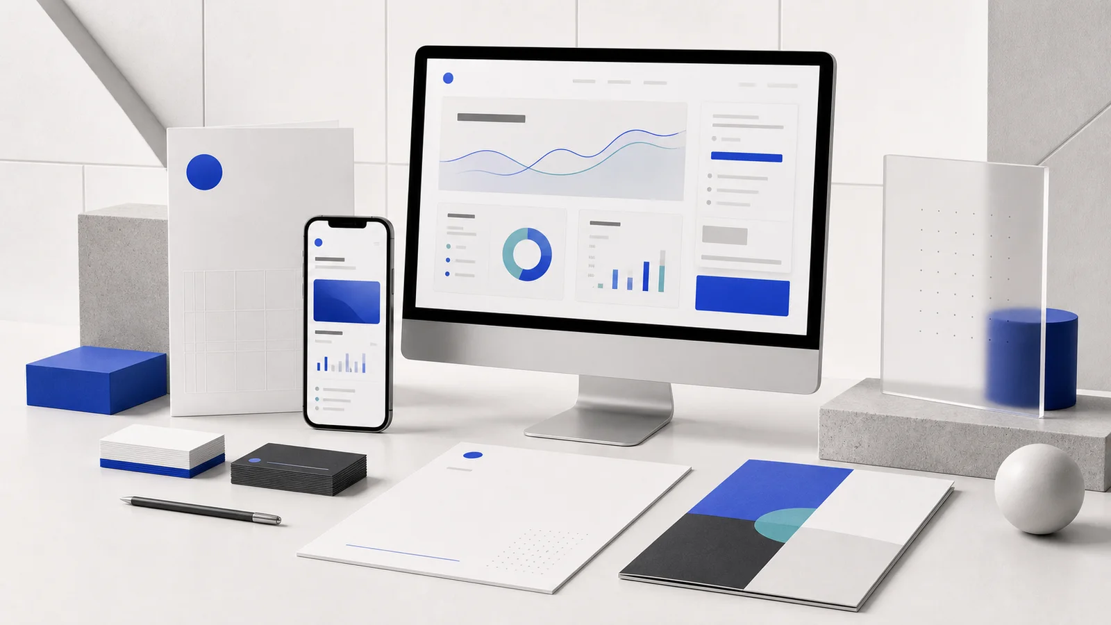
Modern Design It's a design approach that emphasizes clarity, function, and order through geometric shapes, sharp lines, clean colors, and grids that help elements work together professionally. Therefore, it's commonly found in tech, startups, agencies, corporations, SaaS, and online businesses that want to convey agility, reliability, and future-proofing.
What is Modern Design? What type of brand is it suitable for?
Modern design, in the context of branding and digital work, refers to organizing information and elements to be easily understood using a clean, systematic, and straightforward visual language. Shapes are often circles, squares, lines, or contrasting colors. Decoration is minimized to serve as a guide for the eye or to create personality.
What makes work look modern isn't just the use of sans serif fonts or blue, but the relationship between structure, content, and usage. Web pages, presentations, and social media should look like they originated from the same system, not separate pieces using similar effects.
Brands that want to convey speed, clarity, and capability.
Modern Style is suitable for businesses that need to explain new things or services that are not tangible, such as software, fintech, cloud, consulting, digital agencies, and online platforms. Grids and graphics help transform complex data into an organized presentation, while white space prevents users from feeling overwhelmed by information.
Modern doesn't mean being cold or emotionless.
Healthcare, education, and other service businesses can also utilize Modern Design by incorporating warm colors, images of people, natural materials, or curved shapes. The structure remains clean and systematic, but the mood and tone don't need to resemble a software company.
How is it different from Minimal Design?
Modern design emphasizes contemporary language and clear structure, while minimalist design focuses on reducing elements to the essentials. A single design can embody both, but Modern design may still utilize more information, cards, graphics, and color, provided it's controlled by a grid and a good visual flow. Read more about the concept of element reduction in this article. Minimal Design
Why do tech brands love using Modern Style?
Many technology products lack a tangible form; customers purchase the system, speed, security, or convenience. Therefore, design must help make these abstract concepts understandable and credible. Modern Style addresses this by utilizing visual languages familiar to the digital world, such as cards, dashboards, diagrams, data visualizations, and modular layouts.
The grid reflects the nature of a system.
When web pages and all media are consistently aligned, viewers perceive accuracy without needing explanation. Orderliness is linked to the feeling that a product has been well-thought-out, especially in SaaS or B2B services where confidence needs to be built before customers try it out.
Shapes help to explain things that are invisible.
Lines, points, circles, and modules can convey themes of connectivity, data flow, automation, or platform components without relying on stock images of people shaking hands in an office. Instead, create shapes from concepts of actual products, rather than simply adding circles and gradients to make the work look tech-like.
The design system is scalable to accommodate the product.
Startups and SaaS platforms change features rapidly, and new media is constantly emerging. Systems composed of clear colors, spacing, shapes, icons, and components help teams launch new pages or campaigns without having to design from scratch every time.
Techniques for creating modern and professional design work.
Start with the grid before beginning the decorating.
Clearly define the column, margin, and main spacing before placing images and text. A grid doesn't force a rigid design, but it helps create points of reference. Designers can intentionally place some elements outside the grid to create rhythm without compromising the overall balance.
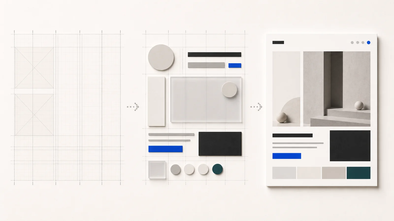
Use few shapes, but create variety through proportions.
Choose a primary shape language, such as a square, circle, or curve, and change its size, cropping, and position instead of constantly adding new shapes. This approach makes the work more unique and easily expandable.
Limit the colors, then choose an accent that you can remember.
A white or light gray background, charcoal text, and one or two accent colors provide a flexible base. Blue is often used because it conveys trust and technology, but it doesn't have to be blue. Red, orange, purple, or green can also work if the contrast is good and fits the brand's personality.
Control the lines and angles to create a consistent system.
If some cards have straight corners while others are very curved, and buttons use a different radius, the design will start to look like components are gathered from multiple sources. Defining a reusable set of corner radius, stroke, and shadow helps create a neat look without needing further editing.
Motion should help explain, not just show movement.
Good animation helps convey relationships, such as cards expanding to reveal details or information flowing from one step to another. If everything floats, rotates, and bounces simultaneously, the work will look more like a demo effect than a professional product.
Designed based on real data and actual screens.
Modern design often looks best in short mockups, but SaaS and corporate applications involve lengthy tables, forms, specifications, and data. Components should be tested with real data from the start. Website UX/UI Design It will help to bring about modernity without sacrificing functionality.
What is the difference between Modern Design and Corporate Design?
These two approaches can coexist, but they have different starting points. Modern Design begins with contemporaneity, flexibility, and user experience, while Corporate Design starts with consistency, reliability, and long-term control of the organization's image.
| Issue | Modern Design | Corporate Design |
|---|---|---|
| Main goal | Contemporary look, easy to use, quick to adapt. | Create brand recognition and consistency within the organization. |
| Visual language | Grid, geometric, modular, digital-first | Can be used in various styles to match the personality and history of the organization. |
| change | Component and visual language updates are faster. | Many existing agencies, documents, and systems must be taken into consideration. |
| relationship | It is one style that organizations can choose to use. | It's an overall system that could be modern, classic, or another style. |
Corporate brands can be modern too.
Large organizations can use a Modern Style to appear more streamlined and accessible while maintaining their logo, corporate colors, and core requirements. The key is to adapt the system to support websites, apps, documents, presentations, signage, and usage across multiple teams.
Modern Style does not replace Corporate Identity.
The choice of shapes, colors, and grids is only one part of a branding system. Organizations also need to define their voice, logo usage, photographs, icons, and other communication guidelines. Read an overview of the organizational system in the article. What is Corporate Identity (CI)?
Examples of modern mood and tone for various businesses.
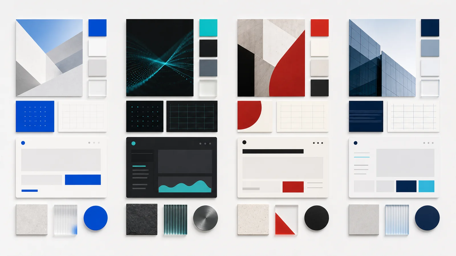
Trustworthy Tech: White, Gray, and Cobalt Blue
Ideal for Fintech, Cloud, Cybersecurity, and B2B Software. Uses bright lighting, organized cards, thin lines, and blue as visual cues to help information appear accurate and accessible.
Dark SaaS: Charcoal and Teal
Suitable for developer tools or AI platforms. A dark background helps charts and interfaces stand out, but the text contrast must be controlled and no excessive glow should make it difficult to read.
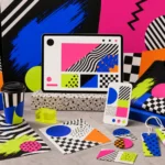
Bold Agency: Off-white, Black and Red.
Ideal for creative agencies and brands seeking a confident look. Uses large, cropped shapes, bold typography, and strategically placed red accents for a modern appearance without the need for gradients or digital effects.
Modern Corporate: Navy, Pale Gray, and Cyan
Ideal for organizations that want a professional yet modern look. Use navy instead of black to soften the appearance. Organize data using cards and grids, and use cyan for buttons or selective data highlighting.
Errors that only make a project look modern temporarily.
Use trends instead of ideas.
Gradients, 3D objects, glass cards, and AI visuals can make a design look fresh, but if they're not relevant to the product, the work will become outdated. It's better to start with the personality and information you need to communicate, and then choose techniques only as necessary.
The grid exists, but the spacing is uneven.
Placing everything as cards doesn't mean the work is systematic. If the spacing, height, alignment, and headings change in every section, the page will still look cluttered. You should define the spacing, scale, and components before adding details.
It looks like SaaS, even though its business isn't SaaS.
The use of fake dashboards, graphs, and portals across all businesses turns Modern Design into a template. Visuals should stem from the brand's true values; a construction company might use structures and materials, while a logistics company might use routes and movement patterns.
It looks clean, but important data is missing.
B2B and corporate businesses have information that customers need to make decisions, such as security, processes, pricing, and case studies. This information shouldn't be omitted to keep the page clear; instead, it should be prioritized and categorized into levels.
Checklist for creating a modern brand that looks good and is practical for long-term use.
- Define your personality clearly: modern and trustworthy, daring, friendly, or serious.
- Set the grid, spacing, and alignment before adding graphics.
- Choose a few primary geometric languages and use them systematically.
- Limit the color palette and define accent colors for key areas.
- Create a component that supports real data, not just a mockup.
- Control lines, angles, shadows, icons, and images to be within the same system.
- Test desktop, tablet, mobile, and accessibility.
- Separate brand principles from trends and their effects.
In summary: Good modern design should be new enough, but not become outdated quickly.
Modern design isn't about simply collecting trendy effects, but about creating a clean, clear, and adaptable visual system. A grid of geometric shapes, sharp lines, and muted colors create a professional look when everything serves its purpose and aligns with the actual brand.
Sustainable, modern work doesn't strive to always look like the future, but rather to make today's data easily understandable and create systems robust enough to accommodate future business additions.
I want to systematically modernize my brand and website.
The Creative team helps develop the mood & tone, grid, UI components, and overall brand image to suit tech, startup, agency, corporate, and SaaS businesses, ensuring the work feels fresh, is user-friendly, and is scalable across all channels.