Some designs don't wait for people to gradually notice them; they immediately grab the eye. Bold colors, bold typography, dramatic shapes, and unconventional layouts make a brand appear confident, fun, and memorable very quickly. However, if not controlled, this boldness can turn into clutter.
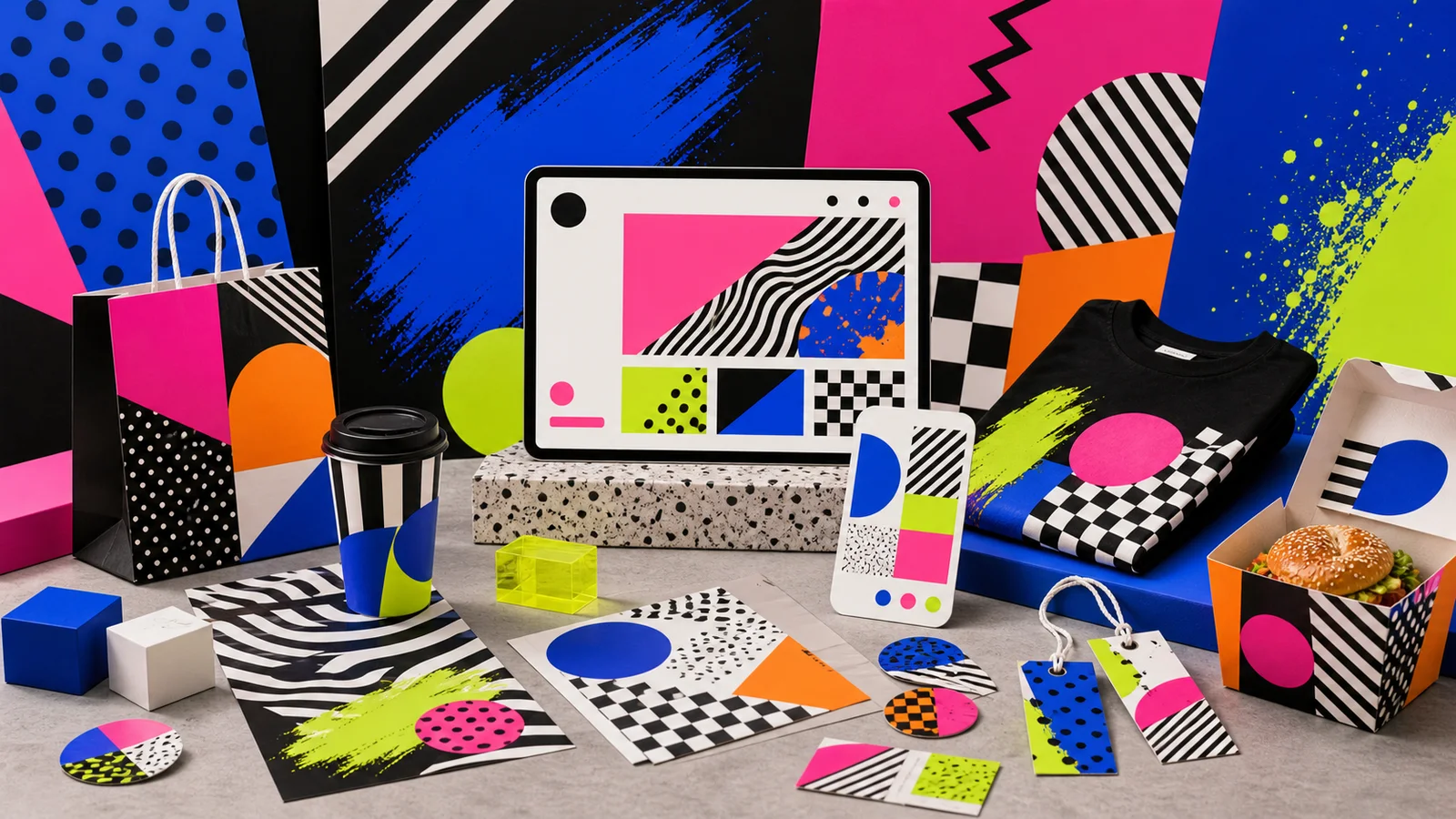
Bold / Maximal Design This design approach intentionally uses the power of color, size, contrast, shape, pattern, and unconventional rhythms to create a striking visual identity. It's ideal for youth fashion, street brands, events, music, food, and brands that don't want to be blended into the same market. This article will explore how professional, bold designs differ from cluttered ones.
What is Bold Design? Why is it so effective at catching the eye?
Bold design is a design approach that uses stark contrast to create visual impact, such as bright colors against black, large fonts against negative space, geometric shapes against photographs, or layouts designed to shift the viewer's eye. These elements convey to the audience that the brand has personality, isn't afraid to express itself, and wants to be memorable.
The reason bold design is so effective at grabbing attention is that our brains prioritize contrast over detail. When there are contrasting colors, striking sizes, or unexpected shapes, the eye pauses to process the information. But grabbing the eye is only the first step. The design still needs to guide the viewer on what they should read, what they should buy, or how they should feel about the brand.
Bold doesn't mean shouting everything at once.
A good piece of work needs a "main character," even if it's over-the-top. It could be a single, impactful sentence, a single accent color, or a central image. If everything is equally big, strong, and prominent, the viewer won't know where to start, and the prominence will cancel each other out.
Bold and Maximal are similar but not the same.
Bold design emphasizes impact and clarity, possibly using few elements but with high size and contrast. Maximal design, on the other hand, often uses multiple layers, patterns, colors, or materials to create fullness and a more immersive experience. Both styles can be used together, but a controlled rhythm is essential.
Important questions before we begin.
What does the brand want people to feel—is it fun, daring, raw, fresh, trendy, or deliciously bold? If the answer is unclear, bold colors and layouts might just become aimless popularity.
How to use strong colors without making your work look cluttered.
Vibrant colors are key to bold design, but problems often arise when all colors are used as primary colors simultaneously. A safer approach is to clearly define color roles: primary colors for creating visual impact, secondary colors for adding rhythm, accent colors for key moments, and neutral colors for visual rest.
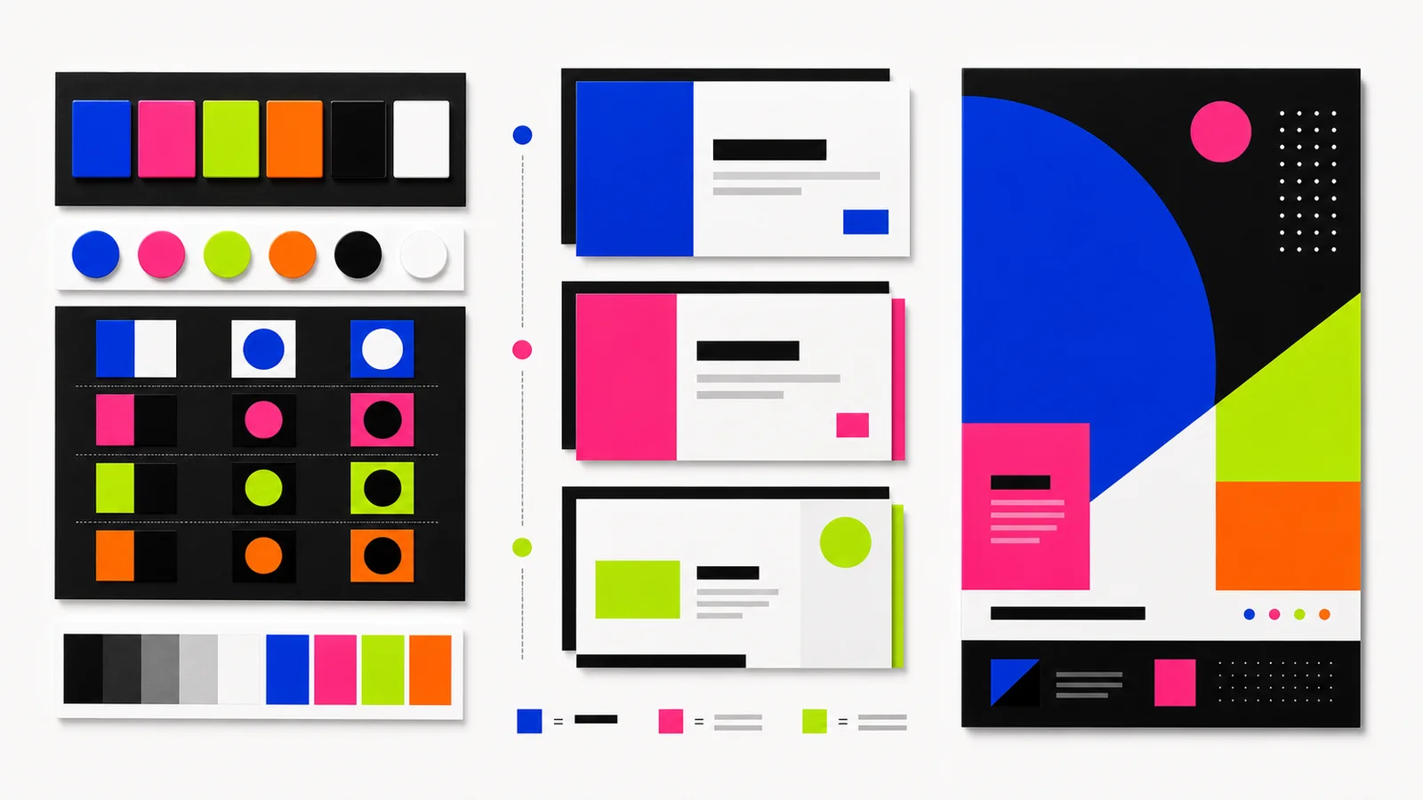
Choose one primary color and let it work.
To make hot pink memorable, avoid having electric blue, acid green, and orange equally dominant in every area. Use the primary color for large areas or key elements, and let the other colors serve as accents. For example, use acid green only on buttons or price tags.
Use black and white to control the intensity.
Black and white help create boundaries for vibrant colors, preventing the overall image from looking washed out or clashing and causing eye strain. A black background makes bright colors appear more intense, while a white background keeps the text easy to read. This is ideal for food, event, and street brands that require a vibrant look while still communicating information quickly.
Contrast should aid readability, not just attract attention.
Pink on orange might look fun on a mood board, but when used with actual text, it can be difficult to read. Always test the colors in relation to fonts, buttons, prices, and key information. Learn more about color mood and choosing the right tone for your brand in our article. The Psychology of Color in Design
Give the colors some space to breathe.
The more vibrant the color, the more space is needed for negative space. If a bright color pattern, photographs, large fonts, and buttons are all close together, the color will have no focal point left.
What type of brand is Maximal Design suitable for?
Maximal design is better suited for brands that sell energy, atmosphere, fun, or a sense of belonging to a culture, rather than products that require a high degree of stillness and formality. These brands often want people to feel the essence first, and then read the details later.
Teen fashion and street brands.
This group often uses bold colors, collage patterns, unusual cropping, and attituded typography to create a sense of community or subculture. Their work should have a memorable element, such as a unique shape, graphic pattern, or signature color, rather than changing everything with every collection to the point of being unrecognizable.
Event, Music, and Festival
This type of event needs to create excitement in a short time. Posters, landing pages, and social media posts are therefore best suited to unique layouts, large fonts, and vibrant colors. However, crucial information such as the date, time, location, price, and ticket purchase button must always be more prominent than decorative elements.
Food and drinks that you're tempted to try.
Restaurants, bakeries, beverage shops, and snack businesses can effectively use bold design to convey flavors, freshness, or novelty. Bright colors can instantly tell the story of sour, spicy, sweet, or fizzy tastes. However, be careful not to let the colors and patterns overshadow the food, making it unclear to customers what you're selling.
Even serious brands can use bold language, if they know where to use it.
Corporate or tech brands may use bold design in specific campaigns, product launches, or hero sections to create appeal while maintaining control over information and user flow using sound design principles. Website UX/UI Design
Does a large font really make a piece of work look more powerful?
True, but not always. Large fonts can help text become visual, allowing readers to perceive the message's personality before reading in detail. This is suitable for headlines, campaign statements, event names, or short, memorable words. However, using large font for every sentence disrupts the flow and makes reading tedious.
Big size comes with sharp words.
Enlarging the font magnifies both power and errors. If the copy is long, vague, or lacks rhythm, the image will appear heavy but not sharp. Before enlarging the font, shorten the words to include only the main message that has enough impact to stand on the larger space.
A large font must have an opposite.
Large headlines appear more powerful when paired with smaller body text, a more muted color, or adequate spacing. Contrast in size is therefore more important than enlarging everything at once. Read more about large font sizes in our article. Bold Typography
Don't forget Thai language and your mobile phone.
The Thai language has vowels, tones, and character heights that need to be tested in practice. Fonts that look bold in English may feel cramped or difficult to read in Thai, especially on mobile phones and small signs.
What's the difference between Bold Design and Minimal Design?
Bold and minimalist aren't right or wrong, but rather different communication strategies. Minimalism helps brands appear calm, clear, and leaves room for what matters, while bold creates impact and builds brand recognition more quickly. The question, therefore, isn't which approach is more aesthetically pleasing, but rather which type of impact is needed in different situations.
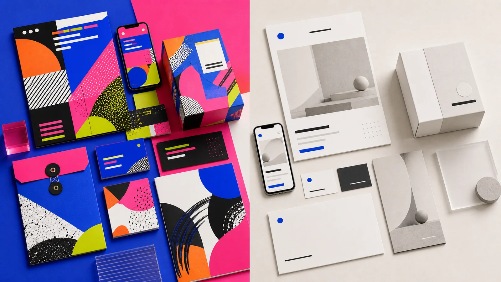
Choose Bold when you need to compete with ambient noise.
Events, fashion drops, food campaigns, or social ads that need to grab attention in the feed might be more suitable for bold advertising, as it requires people to pause and then continue reading.
Choose Minimal when you need calmness and clear decision-making.
Premium B2B services, clinics, real estate, or products requiring extensive data may use a minimalist approach as a foundation to build user understanding and trust. Read more about reducing elements in our article. Minimal Design
Both approaches can be used together.
Many brands use bold hero or campaign pages but a simpler product detail pages so that the impact and readability work together; it's not necessary to stick to one style across all screens.
Mistakes that make bold text look cluttered instead of striking.
No visual order.
The colors, shapes, and typography are all equally prominent, making it difficult for people to know what to look at first. Only one or two hero elements should be designated.
Using many patterns without leaving any pauses.
Dots, checks, diagonal lines, and textures can coexist, but there must be resting areas or flat surfaces in between; otherwise, the design will become a single surface without a focal point.
Beautiful in a single image, but cannot be scaled up systematically.
Bold branding requires rules such as primary colors, patterns, shapes, and font usage. Creating only a single poster without a system will quickly lead to the work losing direction when used across multiple websites, packaging, or social media platforms.
Bold/Maximum design checklist for a striking yet controlled look.
- Clearly define what kind of "boldness" you want the brand to have.
- Choose the main element of the design first, such as the main color, font style, or main image.
- Use vibrant colors strategically, rather than using all colors as primary colors simultaneously.
- Use black, white, or neutral colors to control contrast and provide eye rest areas.
- Large fonts are used for concise and essential text.
- Patterns and textures must have rhythm; they shouldn't cover every area completely.
- Important information, such as date, time, price, buttons, and product details, is still easy to read.
- The rules were set to allow for expansion from the poster to websites, social media, and packaging.
In summary: Good bold design requires courage and direction.
Bold/Maximal Design isn't about using excessive bright colors, large fonts, and patterns. It's about leveraging those elements to create a memorable visual and emotional impact for your brand. Knowing where to emphasize, where to pause, and what information to keep clear, even a bold design can still look professional.
For brands looking to stand out in an already noisy market, boldness can be a key advantage. However, unsystematic boldness won't last long. Truly eye-catching work needs to be impactful, memorable, and drive people to the next level.
I want to make the brand stand out without becoming clutter.
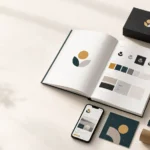
The Creative team helps establish the mood and tone, color scheme, typography, layout, and overall brand image to create a powerful visual impact that grabs attention while remaining practical for use across websites, campaigns, social media, and packaging.