When you first assign a project to a designer, they might ask, "Do you want an AI or PSD file?" or "Should I use CMYK or RGB?" — if these kinds of questions confuse you, this article will help.
The graphic design industry has a wealth of terminology because it's a discipline that blends art, psychology, and printing technology. At first, it might feel like learning a whole new language, but understanding just 30-40 key terms is enough to communicate effectively with designers, accurately review their work, and make informed decisions about what's best for your business.
Why do we need to know graphic design terminology?
The most common problem in graphic design is "misunderstandings"—the client says they want something "simple," the designer sends the work, but the client feels it's "not what they expected." Both sides waste time on revisions.
Knowing basic vocabulary helps you:
- The project brief became more precise — allowing for clearer specifications such as whether a minimalist or maximalist design is desired, and whether sans-serif or serif serif designs are preferred.
- Accurate proofreading — noticing inconsistent character kerning or files submitted as raster when they should be vector.
- Request the right file type — don't accidentally ask for a PSD file from a designer who uses Illustrator.
- Better assess the quality of design work.
Section 1 — Typography & Layout
Letters are not just "words," but are an important tool for communicating emotions and meaning. Good typographyInstantly transform ordinary tasks into professional-looking ones.
Font vs Typeface
Many people use these two words interchangeably, but they are actually different. Typeface It is a set of typefaces designed in the same style (e.g., Helvetica, Times New Roman). Font The typeface is the file used to display that typeface (e.g., Helvetica Bold 12pt). Comparison: The typeface is the music; the font is the MP3 file of that song.
Serif vs Sans-serif
- Serif — Fonts with "bass" or small strokes at the ends of the letters give a classic, formal feel (e.g., Times New Roman, Georgia).
- Sans-serif — Serif fonts, clean and modern in appearance, suitable for digital work (e.g., Helvetica, Arial, Open Sans).
- Script — Handwritten fonts are suitable for luxurious items and premium food and consumer goods.
- Display — This font is designed for emphasis and is suitable for major headings; it is not ideal for long text snippets.
Kerning, Tracking, Leading
These three words represent "distance," a concept that designers place great importance on.
Kerning
The spacing between two adjacent letters, such as between the letters A and V, sometimes appears too far apart. Designers adjust the kerning to make it just right.
Tracking
The spacing between characters in a "group" can be used to make the text appear more open or denser.
Leading
Appropriate line spacing in leading text makes it easy to read and avoids feeling cramped.
Hierarchy
Hierarchy It's about visual order. Designers use font size, color, and weight to tell readers what to read first and what to read later.
Alignment
There are four main text alignment options: Left, Right, Center, and Justify. Choosing the wrong one instantly makes your work look unprofessional.
Grid System
The grid structure is used to arrange elements in an orderly manner, making the design look balanced and neat. Almost every professional designer uses a grid as a starting point for their work.
Category 2 — Color
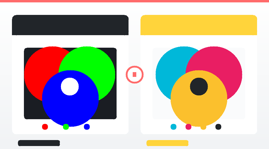
RGB (Red, Green, Blue)
The color mode for all types of "screens" — mobile phones, computers, TVs — uses three colors of light mixed together to create other colors, called... Additive Color Because the more you mix them, the brighter it becomes; combining all colors results in white.
CMYK (Cyan, Magenta, Yellow, Key/Black)
The color mode for "printing" uses a mixture of four inks, called... Subtractive Color Because the more you mix them, the darker the color becomes; combining all colors results in black.
Hex Code
The color codes used on the website start with # followed by 6 digits (alphanumeric), such as #FF6B6B (bright red). The hex code is derived from the hexadecimal system and corresponds to the RGB mode.
Color Palette
For any given project, professional designers often limit their color palette to 3–5 primary colors to ensure the work appears unified and not cluttered.
Hue, Saturation, Brightness (HSB)
- Hue — Shades of color (red, yellow, green, etc.)
- Saturation — Color vibrancy: Low value = light/dull colors, high value = vibrant colors.
- Brightness — Brightness: Low value = Dark, High value = Bright
Gradient & Duotone
Gradient It's a smooth gradient from one color to another. Duotone It involves reducing the image to just two primary colors, creating a unique mood. Gradient and Duotone techniquesWidely used in branding and modern websites.
Pantone (PMS)
The international standard color system used in the printing and production industry ensures consistent printed colors every time, no matter where in the world it's printed. Major brands like Coca-Cola and Tiffany & Co. use Pantone to maintain accurate brand colors.
Section 3 — Files and Formats
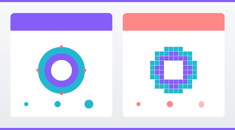
Vector vs Raster
These are two different types of digital images, differing in both how they are created and their uses.
Vector
Images created from "mathematical equations" — lines, curves, shapes — remain sharp no matter how much they are scaled up. Suitable for logos, icons, illustrations. Formats: AI, SVG, EPS
Raster (Bitmap)
Images composed of a large number of pixels, when enlarged beyond their original size, will show individual pixels (breakdown). Suitable for photographs and highly detailed illustrations. Formats: JPG, PNG, GIF, PSD.
File formats you need to know.
JPG / JPEG
The most popular standard image file format is small, suitable for photographs and online work, but... Transparent backgrounds are not supported. And it's a lossy compression.
PNG
Higher quality image files than JPG are supported. transparent background Suitable for logos, icons, or images that need to be overlaid on another background. Disadvantage: Larger file size than JPG.
GIF
Image files that support animation have limited color capabilities (256 colors), making them suitable for simple images and short memes/animations.
SVG
Vector files for websites are sharp no matter how much they're scaled, are small in size, load quickly, and are searchable by search engines. They are ideal for logos and icons on the web.
A document format that maintains a consistent layout across all devices it's opened on. Commonly used for quotations, portfolios, and submissions to print firms.
AI (Adobe Illustrator)
Adobe Illustrator source files for vector graphics are fully editable and can only be opened with Illustrator.
PSD (Photoshop Document)
Adobe Photoshop source files store all layers, allowing for detailed editing, making them suitable for raster and composite images.
INDD (InDesign)
Adobe InDesign files for layout design of multi-page documents such as magazines, books, and brochures.
DPI vs PPI
DPI (Dots Per Inch) = Print resolution. The standard value is 300 DPI.
PPI (Pixels Per Inch) = Screen resolution. Standard value is 72–96 PPI for web.
Section 4 — Techniques and Components
Mockup
Renderings that depict the design in a "real-world context," such as a logo on clothing, a label, or packaging, give clients a clear picture of what the finished product will look like in real life.
Mood Board
A sketchboard containing images, colors, fonts, and references that reflect the "mood" of the project, used to communicate the direction before starting the actual design process.
Branding / Brand Identity
Branding It's everything that creates brand awareness, from the logo, colors, fonts, tone of voice, to the customer experience. Brand Identity It is a set of visual elements used to communicate a brand.
Logo Types
- Wordmark — Logos that are all brand names, such as Google, Coca-Cola.
- Lettermark — Abbreviations such as IBM, HBO, NASA.
- Pictorial Mark — Symbols that convey a literal meaning, such as the Apple logo and Twitter logo.
- Abstract Mark — Abstract shapes, such as the Nike Swoosh logo and Adidas logo.
- Mascot — Cartoon characters are used as logos, such as KFC Colonel and Michelin Man.
- Emblem — Logos that contain letters within a shape, such as Starbucks or Harley-Davidson.
Composition
Arranging elements on a presentation should be balanced, highlight focal points, and effectively draw the viewer's eye. Popular principles include: Rule of Thirds, Golden Ratio, and Symmetrical/Asymmetrical Balance.
White Space (Negative Space)
Empty spaces—are not wasted space, but rather a crucial tool that contributes to a clean, elegant design and helps viewers focus on what's important, according to the concept. “"Less is More"”
Visual Hierarchy
Visual prioritization tells viewers what to look at first and what to look at later, using size, color, and position.
Contrast
The difference between elements, such as lightness/darkness, size, and thickness—good contrast—makes the work interesting and easy to read.
Section 5 — Printing
If you're designing for print, you need to know these terms to communicate effectively with the printing company.
Bleed
The "excess" area is designed to extend 3 mm beyond the paper edge to accommodate potential cutting inaccuracies. Without bleed, a white border may appear after printing.
Trim
The final size of the paper after cutting is the actual size the customer will receive.
Safe Area
The "inside" area, safe from cutting, should only be used for essential text and elements.
Embossing / Debossing
Embossing = Raised/Convex | Debossing = Reduce the size/dimension; a technique to add depth to business cards, labels, or packaging.
Foil Stamping
The technique of applying foil stamping (gold, silver, or other colors) onto paper gives it a premium look. It is commonly used for luxury business cards and wedding invitations.
UV Coating / Spot UV
Spot glossing, such as on a logo for a business card, makes that area stand out and adds dimension.
Mockup before printing
Before ordering large quantities of printed materials, printing companies usually do the following: Proof Please review (sample image of actual printed copy) to confirm that the colors and details are correct.
In short — a table of vocabulary words to memorize.
| vocabulary | group | meaning |
|---|---|---|
| Serif / Sans-serif | Typography | Serif font / Non-serif font |
| Kerning | Typography | The distance between two letters. |
| Leading | Typography | line spacing |
| RGB | Color | Colors for the screen |
| CMYK | Color | Colors for printing |
| Hex Code | Color | The color code on the website is #FFFFFF. |
| Pantone | Color | International color standards for printing. |
| Vector | File | No matter how much you enlarge it, it remains sharp (AI, SVG). |
| Raster | File | Pixelated images (JPG, PNG) |
| DPI / PPI | File | Resolution (300 prints / 72 screens) |
| Mockup | Technique | A simulation of the job in a real-world context. |
| Mood Board | Technique | Work mood reference board |
| White Space | Technique | A blank space that keeps the work area clean. |
| Bleed | 3 mm excess paper margin | |
| Foil Stamping | Glossy foil stamping |
You don't need to memorize all of these words in a single day, but the more you see them, the more familiar and fluent you'll become. The important thing is to start noticing them when you see them in conversations or in work submitted by designers.
Have an idea in your head but lack someone to bring it to life?
The Creative team oversees the work. Graphic design From banners and infographics to branding and print design, we offer a one-stop shop. No need to hire multiple designers; just tell us your requirements — and we'll handle the rest.