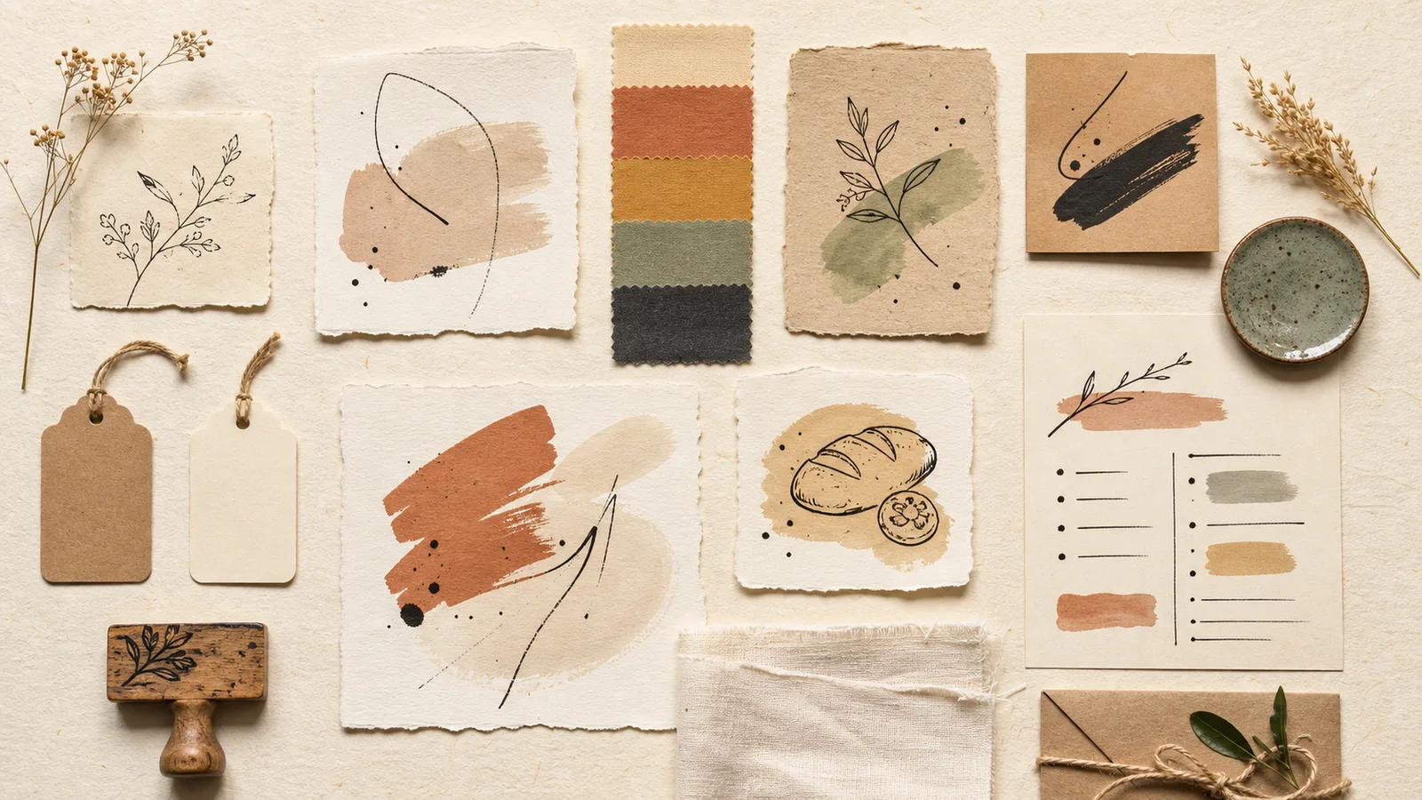
Packaging with uneven ink stamps, paper labels showing visible fibers, or small drawings that look like they were hand-painted by the shop owner—these may not be the polished look of industrial-grade products, but they make us want to pick them up and examine them closely, giving us the feeling that someone put a lot of thought into making this item.
Handmade / Craft Design It's about using a handmade feel to create a brand image through hand-drawn lines, paper texture, warm colors, personality fonts, and imperfect details that don't look rigid. This is suitable for crafts, bakeries, local brands, gift shops, and small cafes that want customers to feel the creator's personality. However, this warmth needs to be designed systematically; otherwise, the work may look cluttered, difficult to read, or too similar.
What is Handmade/Craft Design?
Handmade design doesn't mean every piece has to be drawn, cut, or printed entirely by hand. Rather, it refers to a visual language that retains the feeling of the "maker." It might encompass pencil strokes with varying weights, slightly uneven paper edges, subtly blended ink, or geometrically asymmetrical illustrations.
These elements help bridge the gap between the brand and the customer, making the product seem to have a story, a backstory, and someone's hand behind it, unlike the factory-like image that emphasizes uniformity.
Handmade work is not the same as unintentional work.
Imperfection in craft design must be carefully selected. Lines may not be perfectly even, but the information must be clearly positioned. Labels might use recycled paper, but the product name and important details must be easily readable. Naturalness, therefore, is not an excuse to neglect quality.
Common elements
- Hand-drawn lines, sketches, or rubber carvings.
- Uncoated paper, kraft paper, and materials with visible textures.
- Stamp marks, ink marks, or colors that are not smooth enough to resemble a digital image.
- Color tones derived from earth, wood, plants, food, and natural materials.
- A font with a human-like personality, yet still readable at a usable size.
Consistency is important, not the amount of decoration.
Brands don't need to use kraft paper, jute twine, leaf patterns, and handwritten fonts all at once. Choosing just two or three elements that complement the product and reusing them rhythmically often looks more unique than embracing every "craftsmanship" symbol on a single item.
How does a handmade style make a brand seem authentic?
Authenticity in design doesn't come from simply writing "homemade" or "local" on a label, but from various details that tell the same story—from the materials and photographs to the language and the packaging method. If a shop owner says they bake in batches, but uses shiny stock photos and packaging that looks like products from an assembly line, the customer's experience won't match the brand's message.
Traces of the manufacturing process help to ensure the product's origin is legitimate.
Sketches of materials, brushstrokes, or photographs of workbenches help people see the process behind a product. A coffee brand might use drawings of beans and their origins, a soap shop might depict the actual herbs used, and a ceramics shop might incorporate traces of clay and glaze into its visual system. These give the craft a tangible evidence, not just an atmosphere.
Subtle discrepancies give the impression that someone is behind the brand.
Unique patterned lines, subtle variations in imprints, or short thank-you notes create an experience different from anonymously produced goods. However, it's important to choose where to highlight these differences. Core information such as the logo, product name, expiration date, and contact details still need consistency.
What types of products are suitable for hand-drawn designs?
Hand-painted artwork is more suitable for products whose value is tied to the person who made it, the materials, the location, or personal feelings, rather than for products that require primary technical precision.

Handmade bakery items, food, and drinks.
Illustrations of ingredients, bread, fruit, or kitchen equipment effectively convey the atmosphere of fresh preparation. This is ideal for homemade baked goods, jams, roasted coffee, tea, and local cuisine shops. However, be careful not to obscure information about flavor, ingredients, and expiration dates.
Ceramics, textiles, jewelry, and home decor.
This product line already has unique textures and processes. The lines can draw inspiration from shapes, tools, or materials, allowing the packaging to avoid overshadowing the product while maintaining the studio's personality.
Gifts, flowers, and items with personal meaning.
Hand-painted artwork evokes a friendly and expressive feeling, making it a perfect complement to cards, gifts, flowers, scented candles, and items purchased for someone special. Having space to add a name or message also helps make the packaging an integral part of the gift-giving experience.
Products to be aware of when using handwritten fonts and illustrations.
Health products, supplements, cosmetics, or products with numerous warning labels can still use hand-drawn illustrations, but important information should be in easy-to-read, clearly structured lettering. Read more about choosing and matching lettering in our article. Basic Typography
How to use textures to make your work look appealing and not cluttered.
Texture allows people to visualize and feel the product even when viewing it through a screen. The visible fibers of paper, the ink bleeding, or the slightly rough texture of cotton fabric bring a product to life compared to a plain background. However, good texture should complement the product, not compete with every word on the label.
Choose only one primary texture.
If using paper with an already clear texture, you may not need to add wood grain, brushstrokes, and image grain all at once. Try choosing one primary texture and using secondary textures only in specific areas, such as using recycled paper as a background and applying ink stamps only to logos.
Real textures and simulated textures should be used differently.
Print work can use real materials to create tactile textures, while websites and social media must simulate textures using images. Files should be compressed appropriately and the intensity reduced to prevent the background from interfering with readability or slowing down website loading.
Tested in a size that the customer will actually see.
A beautiful texture on a large screen may become patchy when printed on small stickers, or disappear completely when viewed on a mobile phone. Always print a sample and view it on a real device before making a decision.
What types of colors should be used for craft work?
Brown, cream, muted green, and terracotta are iconic colors associated with craftsmanship, as they are linked to paper, clay, wood, and natural materials. However, this doesn't mean every local brand has to use the same color palette. A fun confectionery brand might use bright pink or yellow, a contemporary ceramics brand might use black and blue, and a florist could use deep purple, if those colors reflect the brand's personality and products.
Start with the color of the materials and the actual space.
Try looking at the colors found in products, stores, and manufacturing processes—like the color of bread crusts, cocoa, the clay of ceramics, the color of woven fabrics, or the colors of cafe walls. Colors drawn from reality often tell a more natural story than colors chosen simply because they are trending.
Clearly define the roles of the colors.
Use one solid color for the background, one color for the text, and one or two accent colors for key areas like flavor stickers, price tags, or order buttons. This gives the brand a warm feel without becoming an all-black, dull color palette. To understand how each color group conveys emotion, read on. The Psychology of Color in Design
Light brown on cream paper might work well in a mood board, but it can be difficult to read when used for product details. There should be enough darkness for key text, and avoid using warmth to prevent important information from being lost in the background.
Create a warm and inviting feel for a small brand through design, without looking amateurish.
The advantage of small brands is that the owner's voice and identity are closer to customers. They don't need to act like a big corporation, but they should have a system in place that customers can recognize, whether it's through the storefront, a package, Instagram, or a website.
Create your own set of drawings.
Instead of buying the same set of leaf images as hundreds of other brands, try creating images from things related to your actual store, such as table tools, product shapes, materials, old buildings in the community, or the hands of the people making the items. A set of just five to ten images can be used for labels, bags, wrapping paper, social media posts, and website pages.
Use handwritten fonts as a garnish, not as part of the entire dish.
Handwritten fonts are suitable for short words such as flavor names, greetings, or short headings. However, longer text, prices, and product details should use easy-to-read fonts. Combining these two styles gives the work personality without sacrificing clarity.
Establish a few simple rules for the team to follow.
Gather logos, colors, fonts, line art, textures, and label placement examples into a single file. It doesn't need to be hundreds of pages long, but it should clearly indicate what can and cannot be used, and where the file is located. Having... Brand Guidelines for Small Brands It helps ensure that work from the shop, the printer, and the content creators remains under the same brand.
Warmth isn't just found on the outside.
The wording on the signs, how chat messages are answered, the cards included in the box, and after-sales service must speak the same language as the design. If the overall image is friendly, but the messaging is full of formal language and rigid procedures, the experience will be immediately disrupted.
Checklist for designing a unique handmade brand.
- The story the brand tells accurately reflects the actual production process and the product.
- Choose illustrations or textures that originate from the brand, not just those following popular styles.
- There should be no more than two or three main components to avoid cluttering the work.
- Handwritten fonts are used only where necessary, and important information remains easy to read.
- The color palette has sufficient contrast both on screen and in print.
- Test the actual materials before mass production.
- The store's image, packaging, social media, and website are all consistent.
- The brand's uniqueness is still visible even after removing the jute twine or kraft paper.
In summary: The charm of handmade design lies in the traces left by the maker.
Handmade/craft design makes a brand seem authentic because it transforms products with no known origin into something with a story, materials, a place, and people behind it. However, the charm doesn't come from simply adding leaf patterns, handwritten fonts, and brown paper.
The key to a memorable task is selecting elements that stem from the brand's authentic identity and then systematically arranging them for reuse. When naturalness is coupled with clarity, a small brand will appear warm without being amateurish and will have a unique identity without shouting to compete with others.
I want the craft brand to have its own unique image.
The creative team helped develop the brand image from concept, colors, design, and packaging to online media, ensuring the brand's warmth stems from the product's authentic story and is consistently applied wherever customers see it.