Some brands use black and gold throughout the space, yet still maintain a promotional signage feel, while others use only a cream background, a single image, and a few lines of text, creating a calm, trustworthy, and valuable image. The difference isn't in the price, the colors, or the amount of decorations, but in how all the details are controlled to speak a consistent language.
Luxury / Premium Design It's a design approach that conveys quality, confidence, and brand status through precise choices of color, typography, photography, materials, negative space, and presentation rhythm. It's suitable for jewelry, real estate, clinics, hotels, fashion, and high-end products. However, the word "luxury" doesn't have just one meaning and doesn't necessarily always require gold.
What is Luxury/Premium Design?
Luxury design is a visual language that conveys that a brand values quality, detail, and experience more than simply selling basic functionality. This type of design often appears calm, allowing space for each element to showcase its value, and avoids rushing to communicate everything at once.
Premium quality, therefore, doesn't come from adding expensive items to a project, but from eliminating unnecessary elements and investing in what remains to be truly excellent. Examples include meticulously controlled lighting in photographs, paper with a unique tactile feel, carefully chosen typography, or a website that guides users through product exploration without being distracted by numerous banners and buttons.
Luxury isn't just one style.
Historic hotels might use antique gold, patterns, and serifs with a classic personality, while contemporary clinics might employ white, cream, light gray, and subtle fonts. Avant-garde fashion brands could use all-black with high-contrast imagery. All can look luxurious if the visual language aligns with the brand's values.
The difference between Premium and Luxury is slight.
Premium often implies a higher-quality option within the same market segment. Customers also compare features and value. Luxury, on the other hand, tends to sell rarity, craftsmanship, status, history, or an experience that doesn't necessarily need to be fully explained for functional reasons.
Before designing, you need to know what kind of luxury the brand wants.
The terms elegant, exclusive, heritage, modern luxury, and quiet luxury evoke different images. Without clearly defining a personality, teams often end up using pre-made black, gold, and serif accents, making the work look more like a generic brand than sophisticated.
What elements must a luxury design include?
The elements of premium work don't need to be numerous, but each must be carefully selected and controlled. The following are some common core elements.
1. Space and a unhurried pace.
When there's enough space around a product, text, or button, it appears to gain prominence. High-end brands therefore often don't cram every promotion, feature, and CTA onto a single screen. Using... White Space A good design helps create calmness and allows the eye to perceive sequence without using many strong frames or colors.
2. Photographs that sell details, not just products.
Luxury imagery often emphasizes light, shadow, materials, and close-up perspectives, such as metallic surfaces, stitching, stone edges, finishes, or the ambiance of a space. The images should evoke tactile sensations and experiences in the viewer without explicitly labeling them as "high quality."
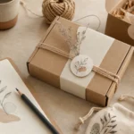
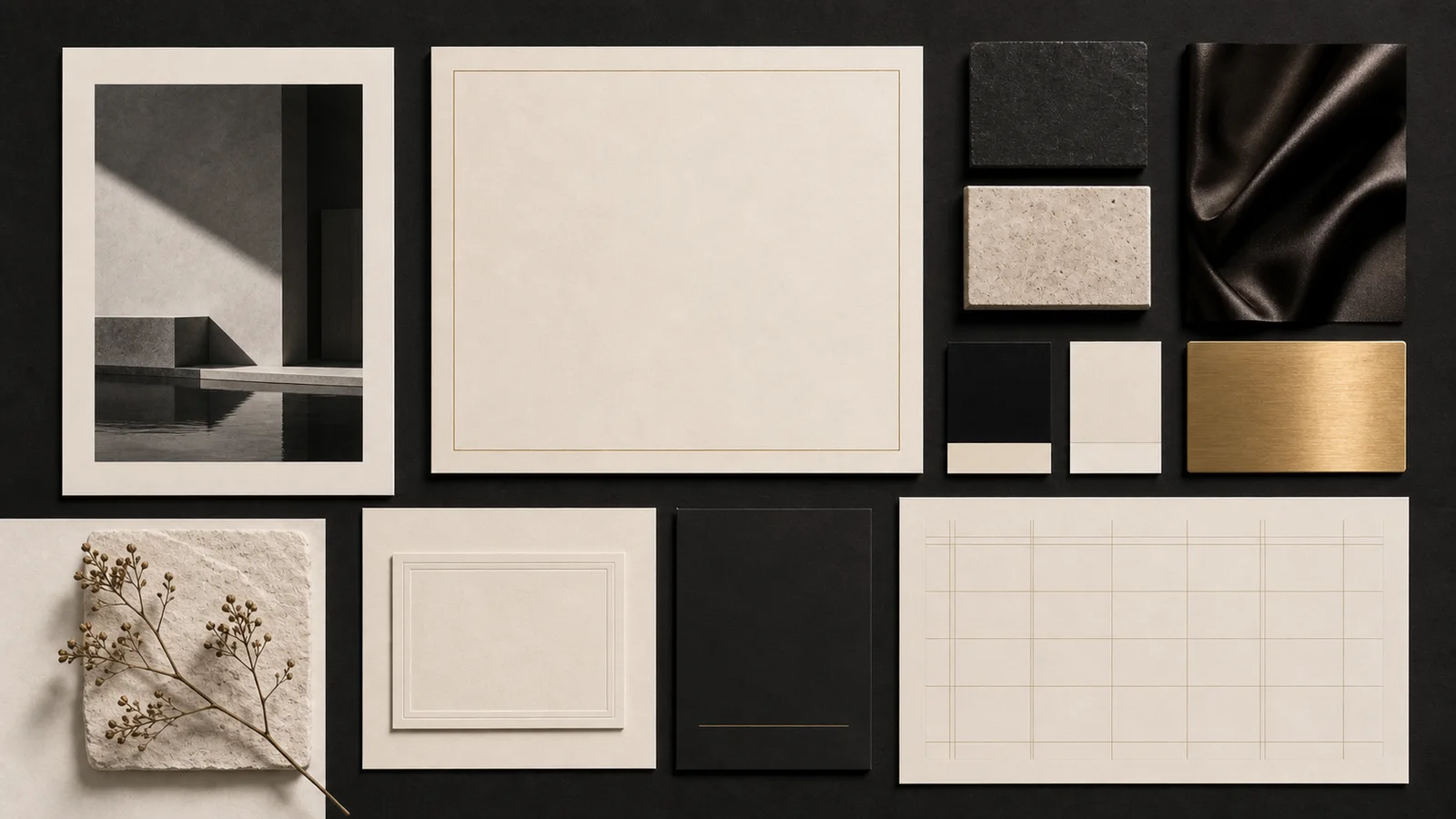
3. Materials with weight and feel.
Thick paper, embossing, foil, brushed metal, velvet, leather, stone, or glass can all help transform visible value into tangible value. However, the choice of material should be relevant to the brand. A clinic might be better suited to frosted glass and clean white paper than black velvet and shiny gold.
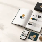
4. Limited colors with clearly defined roles.
Black, white, cream, brown, and gold are commonly used color palettes because they offer contrast, calmness, and an association with high-quality materials. However, not all colors should be used equally; there should be clear distinctions between base colors, text colors, and accent colors that play distinct roles.
5. Consistent system at all contact points.
A high-end-looking bag but a cluttered website, or a luxurious-looking advertisement but a quote using mismatched colors and fonts, instantly undermines credibility. Luxury business requires consistency throughout, from the logo and packaging to photography, website, social media, documentation, and in-store services.
Why does gold make a brand look expensive?
Gold has long been associated with precious metals, rarity, power, ceremonialism, and success. When used in design, it quickly evokes a sense of value. Furthermore, the gold surface responds to light, giving the material a dimensional appearance that sets it apart from flat, printed colors.
However, gold doesn't automatically make a piece expensive. Too much gold, bright brass on a black background, or a metallic gradient that doesn't correspond to the actual material can make the work seem to be trying to proclaim luxury rather than convey quality.
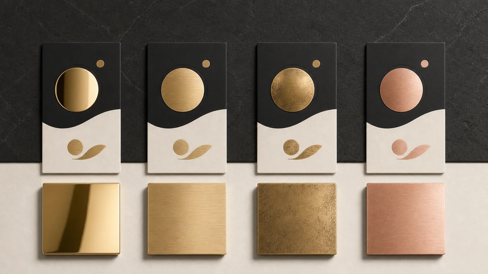
Shiny gold: Distinctive and formal.
Mirror Gold is highly reflective, making it ideal for small areas you want to draw attention to, such as edges of boxes, logos, or bottle caps. If used on a larger area, it will be very striking and may easily become overly flashy.
Champagne Gold: Contemporary Luxury
Soft, toned gold evokes a sense of calm, making it ideal for clinics, hotels, residences, and beauty brands seeking a premium yet understated look. It pairs well with cream, warm gray, brown, and light-colored stones.
Antique Gold: Has history and craftsmanship.
An aged gold finish with traces and unevenness conveys heritage, craft, and the passage of time, making it ideal for vintage hotels, handcrafted jewelry, tea, perfume, or products that tell a story from the past.
Using gold as an accent is more powerful than using it as the background.
Start with a black, white, or cream background, then use gold on just a few points you want to emphasize, such as a logo, dividing lines, or headings. Having areas where the gold can reflect and stand out makes the colors appear more valuable than scattering gold across the entire piece.
The gold color on the screen and in the print are not the same.
On screen, gold is merely a simulation using color and light. For print, foil, metallic ink, or actual metal materials can be used. A sample should be tested before production, as gold that looks good in a mockup may appear yellower, browner, or duller than expected in actual printing. Read more about choosing colors based on brand mood in our article. The Psychology of Color in Design
What type of font makes a design look luxurious?
Fonts can add a touch of luxury to any design because the shape and rhythm of the letters create personality even before the reader finishes reading. However, there isn't one single font type that works for every luxury brand. The choice depends on the era, product personality, language, and actual usability size.
High-contrast serif for fashion and elegance.
Serif fonts, with their distinctly thick and thin lines and tall, airy proportions, evoke an editorial feel, making them suitable for fashion, perfume, jewelry, and hotels. However, very thin lines may be lost on mobile phones or certain printed materials, so they should be used for major headings, and a weight that remains clearly visible should be chosen.
Old-style serif for a classic and reliable look.
Serif pentagrams with evenly spaced strokes and a natural readability convey a sense of history and warmth, making them suitable for real estate, heritage hotels, restaurants, wine, and services requiring long-term reliability.
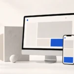
Thin Sans Serif for Modern Luxury
Sans serif fonts, with their flat design and wide spacing, create a contemporary, clean, and architectural look, suitable for clinics, technology, real estate, and lifestyle brands. However, the term "thin" shouldn't mean so thin that it's unreadable, especially for long texts and small screens.
The luxury lies as much in the typography as in the font itself.
A good font can instantly lose its character if the spacing is too tight, the line lengths are too long, or if multiple font sizes are used without a system. Premium work often uses only a few font styles but pays great attention to letter spacing, line height, alignment, and the proportions between headings and content.
The Thai language test is separate from the English language test.
An elegant-looking Latin font might not have a Thai language support, or the weight and height might be unbalanced when paired. It's advisable to test actual text, including headings, prices, details, and buttons, before making a decision. Don't rely solely on English words from the mood board. See the principles of font pairing and testing here. Basic Typography Guide
Customize luxury design to suit each business.
Businesses that sell high-priced products don't necessarily require the same level of luxury. The choice of visual language should begin with what customers need to believe and feel.
Jewelry and watches
Focus on close-up shots that highlight material textures, precision, and neutral space to make the product the star. Black or cream colors help control the scene, while gold should complement the product's actual metallic color.
Real estate and hotels
The sale should encompass the space, light, view, materials, and lifestyle. Architectural imagery and storytelling are more important than simply adding a gold plaque. The work should evoke a feeling of space that is as significant as the actual location.
Clinics and beauty
Luxury must go hand-in-hand with cleanliness, safety, and easily understandable information. White, cream, warm gray, and champagne gold are often more suitable than black and dark gold. Medical information, procedures, and standards should not be compromised to maintain a sense of spaciousness.
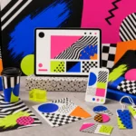
Fashion and lifestyle products
Art direction and photography shape a brand's world. Luxury can stem from minimalism, rawness, or surrealism; it doesn't always have to be classic. Read more about controlling the overall image in the article. Art Direction Fashion Store
Mistakes that make luxury goods look cheap.
Using too much gold has resulted in nothing outstanding.
When the background, frame, lettering, and icons are all gold, the gold becomes bland and loses its role as an accent. Choose placements where you truly want the eye to stop.
Using stock images that are not related to the product.
Images of luxury cars, champagne, or marble may quickly convey the word "expensive," but if they don't reflect the actual brand experience, the work will look like ready-made illustrations. It's better to invest in your own product visuals, space, team, and materials.
The image is too thin, small, and has too low contrast.
Some gray fonts on a cream background may look nice on a large screen, but are difficult to read in practice. Premium features shouldn't be a burden to customers. Important information, pricing, terms and conditions, and buttons must always be clearly visible.
Luxurious decor, but the service and attention to detail are lacking.
Design can only set expectations. If the website is slow, images are blurry, boxes are damaged, chat responses are inconsistent, or after-sales service is complicated, the perceived luxury will only highlight the mistakes.
Checklist for creating a luxurious premium brand with a rational approach.
- First, determine whether you want modern, heritage, exclusive, or quiet luxury.
- Choose a limited color palette and clearly define the role of accent colors.
- Use real photographs that showcase the materials, details, and user experience of the product.
- Give space to things that want to create value.
- Choose a font based on its personality and actual readability, not just because of its thin strokes.
- Test your Thai and English language skills (mobile and typing).
- Use gold and metallic effects strategically chosen for a reasonable purpose.
- Maintain consistency in your brand image across advertising, website, packaging, and services.
In summary: Luxury isn't about wearing a lot, but about making the right choices.
Reliable luxury/premium design doesn't try to announce its expensive status every second, but rather conveys quality to customers through consistent visuals, materials, typography, space, and details.
Gold evokes a sense of value, serifs create elegance, and black adds weight. But they are all just tools. What truly makes a piece of work sophisticated is knowing when to use them, how much to use them, and what brand story to tell.
We want the brand to appear premium, without falling into the old stereotype.
The Creative team helps design the art direction, color scheme, typography, visuals, and website experience to naturally reflect the product's level, from defining its personality to the details that customers actually see and experience.