
Table of Contents
Have you ever wondered why some websites are so captivating you lose track of time, while others cause eye strain just by opening them? The answer to this mystery isn't in beautiful images or amazing animations, but in the simplest thing: “"character"”
Typography, or what people in the design industry call... Typography It's not just about typing text on a screen; it's the art of powerful communication. If you are...Designing website UX/UI that is user-friendly, visually appealing, and ranks highly on Google. Understanding the basic principles of typography is an essential skill.
1. What is typography? Why is it more important than you think?
Typography (visual art of typography) Typography is the science and art of arranging letters, text, and space to make content easily readable, clear, and appealing. It encompasses everything from choosing a typeface, defining its size and weight, to line spacing and height.
In an era where people spend only a few seconds scanning content on a screen, using... Bold typography, or large font size, on websites. It is considered one of the strategies that helps attract attention immediately. In addition, typography is a voice that reflects... Brand Identity Clearly, the font you choose can tell you whether your brand looks luxurious, fun, or formal.
2. Getting to know the 4 main font categories (Font Categories)
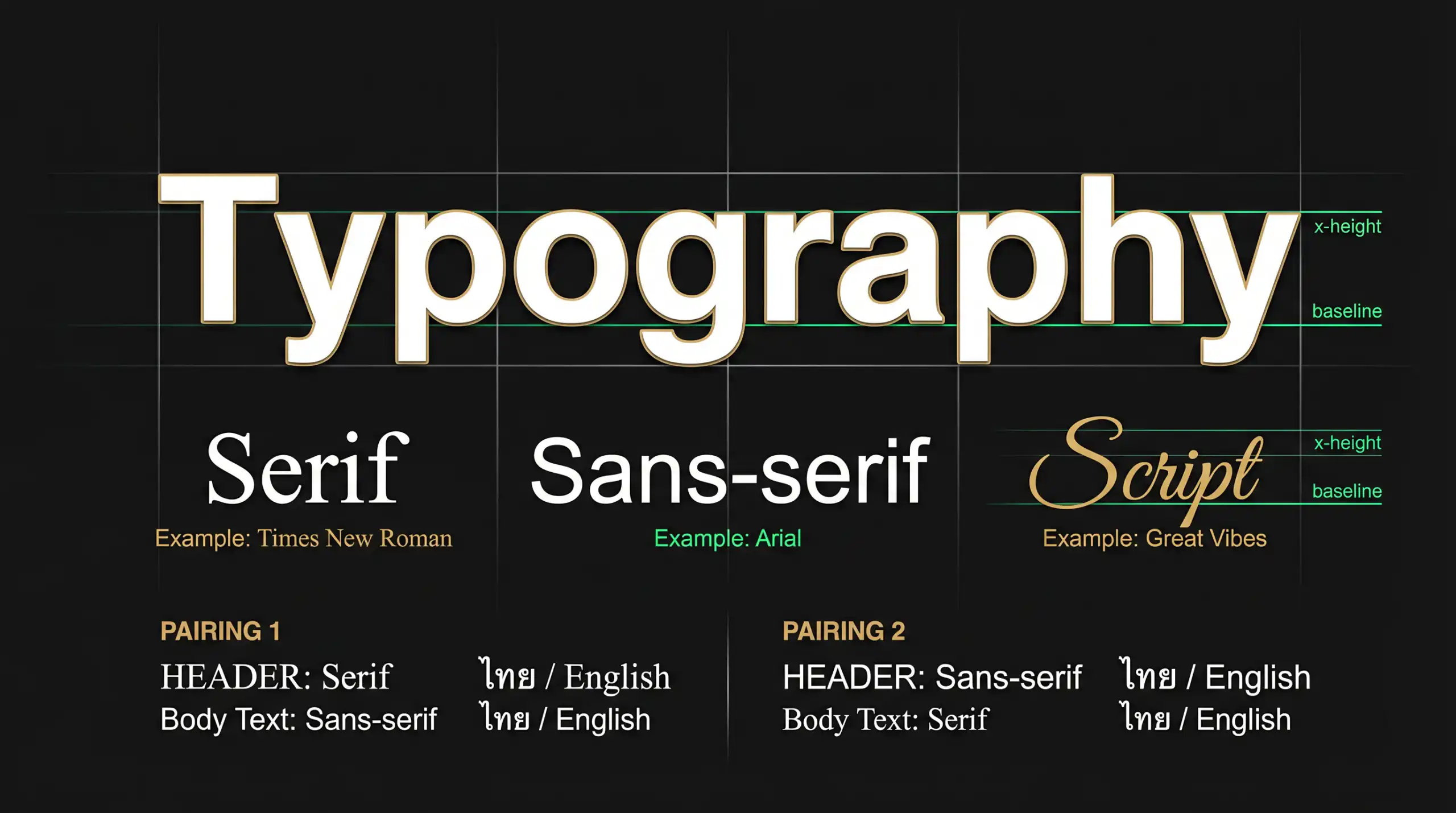
Before choosing a font, we need to understand the personality of each font group. Generally, fonts are divided into four main types:

The image illustrates the personality and usage of the four font types.
2.1 Serif (Serif font)
Classic fonts with small "strokes" or "bass" at the ends of letter strokes (such as Times New Roman) convey a sense of reliability, formality, originality, and elegance. They are often used in print, newspapers, and on websites of high-end law firms and brands.
2.2 Sans-Serif (Fonts without serifs)
Fonts that have had their serifs removed (such as Arial, Helvetica) look clean, modern, and are very easy to read on digital screens. This makes them a top choice for tech companies, startups, and design styles. Minimalist design that emphasizes simplicity yet is powerful.
2.3 Script (Handwritten font)
This font, which mimics handwriting or brushstrokes, evokes a personal, delicate, and creative feel. It's ideal for weddings, beauty brands, or as short headlines to grab attention (though it shouldn't be used with longer text as it will be difficult to read).
2.4 Display (Ornamental font)
Highly distinctive fonts are designed specifically for large sizes, such as headlines, posters, or logos. These fonts are meant to "shout" and attract attention, but, like script fonts, they should never be used for lengthy content.
3. The Art of Font Pairing
Using only one font can make a webpage look bland, but using too many can make it look cluttered and confusing. The golden rule of font pairing is: “"A perfect contrast"
- Classic recipe: Use a serif font for headings to make them stand out, and a sans-serif font for the body of the text for easy readability on screen.
- Tech-related formula: Use sans-serif for both, but choose different weights; for example, use bold for headings and regular for content.
- Caution: Avoid pairing fonts that look too similar, as this will appear more like a display error than an intentional design choice.
4.5 Golden Rules of Typography for Web Design
Besides choosing the right font, layout is equally important. Here are five principles that will instantly make your website look more professional:

Key elements in typography on a website.
1. Hierarchy (Priority)
Use size, weight, and color to guide the reader's eye to where to begin reading. The main heading (H1) should be the largest, followed by subheadings (H2, H3) and the main content.
2. Contrast
Ensure that the font color contrasts sharply with the background color. Light gray font on a white background may look aesthetically pleasing in a minimalist way, but it creates significant difficulties for users.
3. Spacing
Don't let the text be so cramped that it feels suffocating. The appropriate line-height (spacing between lines) is usually around 1.5 times the font size, to allow the eye to comfortably move up and down.
4. Alignment
For languages read from left to right, such as Thai and English, left-aligning text is the easiest to read. Avoid centering text that is longer than three lines.
5. Readability
The optimal line length for reading on a screen is 60-75 characters per line. If it's longer, the reader will have difficulty scanning back to the next line. If it's too short, the eyes will have to work harder to jump up and down the lines frequently.
5. Conclusion: Let the letters do the work for you.
Typography isn't just about aesthetics; it's about... “"organ"” For your website, choosing the right font and placing it appropriately will enhance its appeal. Corporate Identity (CI) To appear professional, credible, and most importantly, to convey your message powerfully and directly to the reader.
Try applying these principles to your next website or design project, and you'll find that simply changing the font can completely alter the overall feel of the design.
Elevate your brand image with professional design.
If you're looking for a team that understands both the science of typography and the art of UX/UI design to create a website that stands out from the competition, our team is ready to provide consultation and turn your vision into reality.